Much of the coding for creating the PDF representation of the Petri Net book was already done in the Oak Island project. This was just a much larger version of the same problem -- more pages, more figures, more fonts, ... But we were producing PDF pretty quickly and then resolving the problems that came up.
Many of the problems were simple and immediately obvious. Running the pdfbuild program would create a PDF file. Looking at the PDF file using the local Linux PDF viewer (evince) would show any problems. Correct the code for that case, rerun it until it looked right.
Then I went to Amazon to create the book project, and upload the PDF file for the book. Big file (1.18 gigabytes), but with compression it came down to only about 12 megabytes.
But after a long time, Amazon rejected the file. But without really saying why. A short note to the Amazon (actually "Kindle Direct Publishing") people and I got back a note that the file showed an error when opened with Acrobat Reader (a standard Adobe program for viewing PDF files on Windows and Mac computers). Acrobat Reader said "Cannot extract the embedded font 'T3Font_33'. Some characters may not display or print correctly." But this did not show up on evince on my Linux computer. But it was clear that Amazon would not take my file if it did not work with Acrobat Reader.
Googling the error message didn't help much, but did reveal the presence of a set of forums run by Adobe -- the Adobe Community. I registered for that and searched to see if I could find suggestions of what was wrong with my files. There were two people MikelKlink and Leonard_Rosenthol who gave good comments in the PDF Language and Specification Forum. They helped with scaling my 600 dpi fonts to make the numbers smaller. The PDF spec suggests units of 1/1000 of a point (1/72 inch), while my units are 1/600 inch (600 dpi). The least common multiple of 1/72 and 1/600 is 1/1800 (25*72 = 3*600), so I could use those units instead of 1/1000. They also pointed out that I was short one byte in my xref at the end of the file -- xref entries have to be exactly 20 bytes; despite having potentially either just a newline (NL) or both a carriage return and newline (CR/NL) for an end-of-line marker.
But that did not resolve the problem with the fonts. I thought it might be a problem with the /Resource objects, but no one picked up on that. Searching for other ways to "debug" a PDF file, I tried using Adobe Acrobat Pro, but it did not give useful error messages either. Eventually I saw a reference to a "PDF repair tool" and found one at ILovePDF.com. I could upload a sample chapter to their site and then download a "repaired" version. The repaired version had no errors with Acrobat Reader, but appeared to be the same image as my file.
So then the problem came down to comparing the two files -- my buggy PDF and the repaired PDF file from ILovePDF. I have a program that reads a PDF and then outputs a human-readable version of it, but the two files still had lots of differences. Some minor (they always use "1 0 0 1 x y Tm" to move to position (x,y) while I use the shorter "x y Td") but the major problem is that they renumbered all the objects. It appeared that they read the entire document into memory, build the object tree and then renumbered the objects starting at the root, and working down, breadth-first. So the root object for their file is object 1 and the first object in the file. My code numbers objects from the bottom of the tree, working up, so the root object is the last object in the file and the highest object number.
So the problem then became one of identifying the corresponding objects in the two files and comparing them, knowing that the important difference must be down in the fonts somewhere.
And after some time, I found a difference.
Some characters, particularly in small point sizes, are very small images -- the period, the single quote, the center dot, and so on. A center dot for example, in a 7 point font is (in my font definition) just 7 bits by 7 bits. Each row has to be rounded up to a multiple of 8 bits, so this becomes an 8 bit by 7 bit image. which is then 7 bytes of data. But compressed data has at least a little bit of overhead, and while a couple of bytes of overhead does not matter when 100K of data is compressed to 7K (plus the couple of bytes of overhead), it does matter when you only have 7 bytes to start with. The "compressed" version of the 7 bytes takes 12 bytes of data. Plus you then have to add "/Filter /FlateDecode" to the description of the object, losing another 20 bytes or so.
So my code was checking to see if the output of compression was bigger than the input, and skipping the compression in that case. But it was doing it wrong. I was not interpreting the return codes from zlib correctly, so that I was adding the /Filter /FlateDecode to the description of the font character image, but not actually compressing the bits. Somehow evince was handling that okay, but Acrobat Reader was not.
But fixing my compression code and using zlib properly solved that problem and got my PDF files accepted by Acrobat Reader (and evince). Which then allowed me to upload the files to Amazon/Kindle and move the book along in the process of getting it available as a print-on-demand book.
Monday, July 22, 2019
Saturday, May 25, 2019
Hough Transform
A search for how to recognize straight lines in an image leads me to the Hough Transform. This is a technique to find straight lines in an image. The idea is to transform the bits in the image space into a "feature space" which reveals the lines.
The idea is fairly straightforward. For each point in the image, we assume that it is on a line. What would the line be? Well, every line thru the point (x,y) is described by the standard linear equation y = ax+b for a slope a and intercept b. If we range over all possible slopes (a), we can then solve for the intercept b: b= y-ax. So if we step a from 0 (horizontal) line to infinity (vertical line), then we get a set of points (a,b) and can plot those in feature space. If we do this for all the points, then for an actual line, with slope A and intercept B, there will be a bunch of points at (A,B) in the feature space. Think of the feature space as an and accumulator array, which starts at all 0, and for each (a,b) corresponding to a point (x,y), we add 1 to that index in the accumulator array. Then the largest value in the accumulator corresponds to the longest line in the image, and gives you the slope and intercept.
The main problem with this, of course, is the slope going to infinity, for a vertical line. So the standard solution is to replace the description of a line as ax+b by a representation as r = x cos a + y sin a, for an angle a and radius r. If we step thru the angles, a, from 90 degrees to -90 degrees, we can solve for r and get a point (a,r) where a is limited from -90 to 90, and r is limited from 0 to the longest distance in the image (which would be the square root of the sum of w squared and h squared for an image of size w by h.) Again, we can use the accumulator array and look for the maximum to find the longest line. Of course, it's not as easy to map the maximum point (A,R) in the feature space back to the actual line in the image space. We solved that by finding the maximum, and then running over the image array a second time, computing (a,r) and marking the image whenever they equal (A,R).
We coded that up, and applying it to Figure 3.34.

and, marking the line found in red

This looks pretty good, but notice the little red parts on the circles:

The algorithm finds a line, but it's the abstract line that goes from one end of the image to the other, not just the line segments that are in the image. But we can probably use other code to find the segments, and keep only the longest ones.
Also notice that the section on the circle (and the little black part on the line below it, shows that it isn't just a line (a one-dimensional mathematical concept), but a line with width. The width is determined by the size of the accumulator array. While we step thru the angles from -90 to +90, we can do that in steps of 1 degree, or 5 degrees, or 1/10th of a degree, defining a different size accumulator array. If the accumulator array is too small, the line found is really wide. Plus, it looks like there may be more than one line mapping into an accumulator cell. So stepping by 2 degrees, recognizes a much wider area as being part of the "line":

Look at the amount of red on the top circle, or on the width of the cross lines.
If we increase the number of steps, increasing the size of the array, for example to 1/10 of a degree, we get a much smaller line being recognized.

This line is only 4 pixels wide. Increasing the size of the array by another factor of 4 (steps of 0.025 degrees) reduces this to one pixel wide. Of course it also runs much slower, because of the larger accumulator array, which must be set to zero and then searched for the largest value after the transform.
Plus, the line that is found is not centered, but seems to go from the right edge of the actual line at the top to the left edge at the bottom, which seems a bit strange. I'm guessing it's something to do with the "angle" part of the description of the line.
And I don't really understand why we have to switch to the angle,distance representation of a line -- Wikipedia calls this the Hesse normal form. I can see the difficulty of an infinite slope for a vertical line, but this is a computer program. We can easily constrain our transformation to slopes between say 45 degrees and -45 degrees (a slope of 1 to -1). That will find all "mostly horizontal" lines, then transpose the image and run it again. Transposing the image will make a vertical line into a horizontal line. We run the algorithm, and then transpose the results back. So first we find all the "mostly horizontal lines", then all the "mostly vertical lines". As long as this partitions the possible slopes we consider, we will get all the lines (since we cover all slopes this way). No need for sines and cosines, and we get the lines in the form of a slope and intercept.
But the Hough transform has another advantage -- it can be used for circles. For circle detection, we use the equation (i - a)2 + (j - b)2 = r2 where (a,b) is the center of a circle of radius r, and (i,j) is a point on that circle. We need accumulator cells for a 3-dimensional array, (a,b,r), in general. If the radius is known, this is just another 2-dimensional accumulator array. A limited sampling of our figures suggests all the circles are about 200 pixels in diameter. Our experience with the linear Hough transform suggests that a larger array means that our diameter has to be more accurate, while a smaller array will compensate for variation in diameter, and noise in the scanning.
And after coding it up, it seems that is the case. The Wikipedia article for the Circle Hough Transform makes it quite clear how to run the code (look down for "The algorithm" and "The voting" for "Find circle parameter with unknown radius"). In our case, since the diameters seem to be about 200 pixels, the radius is assumed to be about 100 pixels, so we run the loop for the radius from 80 to 120. This ends up being a bit problematic for finding circles, since each point now takes 40 loops for the radius, and then 360 for the angle, so the time for computation increases substantially. But for test purposes, we cut out just the circle part of a Figure, and use it to develop our code:

Our first run at recognizing the circle says it is a success, but the result, with the circle in red, looks to be the same as what we started with:
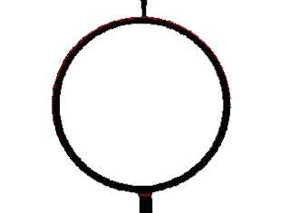
There is just the hint of a red section at the bottom, and enlarging the image, we see, at the pixel level,
 The code found the circle, and from the position of the maximum in the array, we know it is a circle with radius 100 and center (158,119) which certainly looks right, but what we see is a circle 9 pixels thick, while the algorithm finds only a 1-pixel wide circle.
Further experimenting with the program and our code reveals a couple of things. Notice how in the image above, while the red codes do define a circle, they are not continuous. A circle with radius 100 would have a circumference of roughly 628 (2πr). But our loop runs from 0 to 360 degrees, so we will notice only up to 360 of these points. For the example above, that's roughly half the points (which looks roughly correct). This suggests we can easily tell a circle from a non-circle -- a circle will have (roughly) 360 points in the accumulator array; significantly less than this means no circle. A short set of tests suggests that 350 or more is a circle (Or we could increase or decrease the number of points around a circle that we test, which would directly impact performance.)
If we use 350 as a cut-off, notice that we are no longer looking for the maximum value, just one that is "high enough". That means we can recognize multiple circles in one run. So if we have 15 circles in an image, we will find 15 peaks above 350, each of which defines the center of one of the circles. In fact, we find peaks both for the maximum radius (as above), but also for all the slightly smaller radii for the width of the circle line. And also maximums for all the slightly off-center circles that use some inner bits and some outer bits of the circle line. So a line with a width of n points creates at least n circles with the same center, and varying diameters, plus circles where the center varies by at most n in both x and y directions. We will need code to consolidate all of these into one wide-line circle.
That turns out to work well, so we can use the Hough Transform for Circles to find all the circles, record them, remove them from the figures and be able to put them back in later. Once the circles are gone, the lines are a bit easier, since (for Petri nets) the lines go from place (circle) to transition (perpendicular line) to place (circle). So almost all our lines are now broken into much smaller pieces.
We did some simple pixel level clean-up of the images. Things like saying any instance of bits that look like

can have the little "pimple" of a bit removed. At 600 dpi, you really can't see that individual bit; you just get a sort of a feeling that the line is not "crisp".
Then the program looked explicitly for horizontal lines. Just horizontal lines. It would check each bit to see if it might be part of a horizontal line, and if so, try to expand it, both left and right to see how long it could be. And also up and down to get a "height" for the line. It would allow a certain amount of "mess" -- the wrong color bit, but not too much. Then the image was rotated 180 degrees, and the vertical lines were found. These were all removed and replaced later.
This meant that the "background" image was just the arrow heads, and non-vertical/horizontal or non-straight lines. Those I cleaned up by hand, put the circles and lines and text back on top of, and the figures were in pretty good shape. The code helped, but it wasn't (isn't) perfect. The figures aren't perfect either. But they are "good enough".
The idea is fairly straightforward. For each point in the image, we assume that it is on a line. What would the line be? Well, every line thru the point (x,y) is described by the standard linear equation y = ax+b for a slope a and intercept b. If we range over all possible slopes (a), we can then solve for the intercept b: b= y-ax. So if we step a from 0 (horizontal) line to infinity (vertical line), then we get a set of points (a,b) and can plot those in feature space. If we do this for all the points, then for an actual line, with slope A and intercept B, there will be a bunch of points at (A,B) in the feature space. Think of the feature space as an and accumulator array, which starts at all 0, and for each (a,b) corresponding to a point (x,y), we add 1 to that index in the accumulator array. Then the largest value in the accumulator corresponds to the longest line in the image, and gives you the slope and intercept.
The main problem with this, of course, is the slope going to infinity, for a vertical line. So the standard solution is to replace the description of a line as ax+b by a representation as r = x cos a + y sin a, for an angle a and radius r. If we step thru the angles, a, from 90 degrees to -90 degrees, we can solve for r and get a point (a,r) where a is limited from -90 to 90, and r is limited from 0 to the longest distance in the image (which would be the square root of the sum of w squared and h squared for an image of size w by h.) Again, we can use the accumulator array and look for the maximum to find the longest line. Of course, it's not as easy to map the maximum point (A,R) in the feature space back to the actual line in the image space. We solved that by finding the maximum, and then running over the image array a second time, computing (a,r) and marking the image whenever they equal (A,R).
We coded that up, and applying it to Figure 3.34.


This looks pretty good, but notice the little red parts on the circles:

The algorithm finds a line, but it's the abstract line that goes from one end of the image to the other, not just the line segments that are in the image. But we can probably use other code to find the segments, and keep only the longest ones.
Also notice that the section on the circle (and the little black part on the line below it, shows that it isn't just a line (a one-dimensional mathematical concept), but a line with width. The width is determined by the size of the accumulator array. While we step thru the angles from -90 to +90, we can do that in steps of 1 degree, or 5 degrees, or 1/10th of a degree, defining a different size accumulator array. If the accumulator array is too small, the line found is really wide. Plus, it looks like there may be more than one line mapping into an accumulator cell. So stepping by 2 degrees, recognizes a much wider area as being part of the "line":

Look at the amount of red on the top circle, or on the width of the cross lines.
If we increase the number of steps, increasing the size of the array, for example to 1/10 of a degree, we get a much smaller line being recognized.

This line is only 4 pixels wide. Increasing the size of the array by another factor of 4 (steps of 0.025 degrees) reduces this to one pixel wide. Of course it also runs much slower, because of the larger accumulator array, which must be set to zero and then searched for the largest value after the transform.
Plus, the line that is found is not centered, but seems to go from the right edge of the actual line at the top to the left edge at the bottom, which seems a bit strange. I'm guessing it's something to do with the "angle" part of the description of the line.
And I don't really understand why we have to switch to the angle,distance representation of a line -- Wikipedia calls this the Hesse normal form. I can see the difficulty of an infinite slope for a vertical line, but this is a computer program. We can easily constrain our transformation to slopes between say 45 degrees and -45 degrees (a slope of 1 to -1). That will find all "mostly horizontal" lines, then transpose the image and run it again. Transposing the image will make a vertical line into a horizontal line. We run the algorithm, and then transpose the results back. So first we find all the "mostly horizontal lines", then all the "mostly vertical lines". As long as this partitions the possible slopes we consider, we will get all the lines (since we cover all slopes this way). No need for sines and cosines, and we get the lines in the form of a slope and intercept.
But the Hough transform has another advantage -- it can be used for circles. For circle detection, we use the equation (i - a)2 + (j - b)2 = r2 where (a,b) is the center of a circle of radius r, and (i,j) is a point on that circle. We need accumulator cells for a 3-dimensional array, (a,b,r), in general. If the radius is known, this is just another 2-dimensional accumulator array. A limited sampling of our figures suggests all the circles are about 200 pixels in diameter. Our experience with the linear Hough transform suggests that a larger array means that our diameter has to be more accurate, while a smaller array will compensate for variation in diameter, and noise in the scanning.
And after coding it up, it seems that is the case. The Wikipedia article for the Circle Hough Transform makes it quite clear how to run the code (look down for "The algorithm" and "The voting" for "Find circle parameter with unknown radius"). In our case, since the diameters seem to be about 200 pixels, the radius is assumed to be about 100 pixels, so we run the loop for the radius from 80 to 120. This ends up being a bit problematic for finding circles, since each point now takes 40 loops for the radius, and then 360 for the angle, so the time for computation increases substantially. But for test purposes, we cut out just the circle part of a Figure, and use it to develop our code:

Our first run at recognizing the circle says it is a success, but the result, with the circle in red, looks to be the same as what we started with:

There is just the hint of a red section at the bottom, and enlarging the image, we see, at the pixel level,

Further experimenting with the program and our code reveals a couple of things. Notice how in the image above, while the red codes do define a circle, they are not continuous. A circle with radius 100 would have a circumference of roughly 628 (2πr). But our loop runs from 0 to 360 degrees, so we will notice only up to 360 of these points. For the example above, that's roughly half the points (which looks roughly correct). This suggests we can easily tell a circle from a non-circle -- a circle will have (roughly) 360 points in the accumulator array; significantly less than this means no circle. A short set of tests suggests that 350 or more is a circle (Or we could increase or decrease the number of points around a circle that we test, which would directly impact performance.)
If we use 350 as a cut-off, notice that we are no longer looking for the maximum value, just one that is "high enough". That means we can recognize multiple circles in one run. So if we have 15 circles in an image, we will find 15 peaks above 350, each of which defines the center of one of the circles. In fact, we find peaks both for the maximum radius (as above), but also for all the slightly smaller radii for the width of the circle line. And also maximums for all the slightly off-center circles that use some inner bits and some outer bits of the circle line. So a line with a width of n points creates at least n circles with the same center, and varying diameters, plus circles where the center varies by at most n in both x and y directions. We will need code to consolidate all of these into one wide-line circle.
That turns out to work well, so we can use the Hough Transform for Circles to find all the circles, record them, remove them from the figures and be able to put them back in later. Once the circles are gone, the lines are a bit easier, since (for Petri nets) the lines go from place (circle) to transition (perpendicular line) to place (circle). So almost all our lines are now broken into much smaller pieces.
We did some simple pixel level clean-up of the images. Things like saying any instance of bits that look like
can have the little "pimple" of a bit removed. At 600 dpi, you really can't see that individual bit; you just get a sort of a feeling that the line is not "crisp".
Then the program looked explicitly for horizontal lines. Just horizontal lines. It would check each bit to see if it might be part of a horizontal line, and if so, try to expand it, both left and right to see how long it could be. And also up and down to get a "height" for the line. It would allow a certain amount of "mess" -- the wrong color bit, but not too much. Then the image was rotated 180 degrees, and the vertical lines were found. These were all removed and replaced later.
This meant that the "background" image was just the arrow heads, and non-vertical/horizontal or non-straight lines. Those I cleaned up by hand, put the circles and lines and text back on top of, and the figures were in pretty good shape. The code helped, but it wasn't (isn't) perfect. The figures aren't perfect either. But they are "good enough".
Friday, May 24, 2019
The Figures for the Petri Net book
The Petri net book has a lot of Figures. 152 of them, at least. Some of the Figures are really just tables, so they can be typeset like the rest of the book, but Petri nets are basically a graphical representation of information or computation flow, so it makes sense there would be a lot of Figures.
The Figures are mainly line drawings, lines and circles, with labels attached to the lines and circles. The labels are text, and can be typeset like the text of the book. We have a "line" type in our representation, but it's really only for either horizontal or vertical lines. It uses the same "box" notation we have for the character boxes -- start and end of x and y coordinates, 4 numbers -- so it's really a black box, not a black line. But if the box is very thin in one dimension or the other, it becomes a line (horizontal or vertical).
But the lines in the Figures are not horizontal or vertical, in general, and most of them actually have arrow heads on them, being directional lines. And then there are the circles.
But we have "images" in our representation. Normally an "image" is used to represent the Figures. In the text, we leave a blank space for the Figure, and place the text above and below it.
However, we can also use the same approach to defining the Figures themselves. So we have a two level structure. First we have a set of files that represent the Figures. These are used to produce GIF images of the Figures. Then we have the set of files for the book, which include the images for the Figures.
For the representation of the Figures, we have two basic parts -- the text which are the labels and the actual drawing. If we create a GIF file which is just the drawing part (the circles and arrows) with no text labels, and include it as an image that covers the entire "page" of the Figure, then we can then list the characters which are the text of the labels and they will be placed on top of the background line drawing. So we can represent each Figure by a background image and a box file with the text.
As an example, consider page 132. The box file for it contains both the text and the image:
...
c gif/p132.gif 1682 314 1698 361 l 8pt i
c gif/p132.gif 1697 318 1710 361 i 8pt i
c gif/p132.gif 1714 323 1732 361 t 8pt i
c gif/p132.gif 1730 328 1765 372 y 8pt i
n gif/p132.gif 371 313 1765 373 newline
i gif/p132.gif 1339 532 2066 1353 figures/gif/5_7.gif
n gif/p132.gif 1339 532 2066 1353 newline
c gif/p132.gif 914 1404 949 1451 F 8pt b
c gif/p132.gif 953 1404 970 1451 i 8pt b
c gif/p132.gif 975 1418 1003 1462 g 8pt b
c gif/p132.gif 1010 1418 1045 1451 u 8pt b
...
We have first the boxes that define where the characters go for the page heading (which is in 8 point italic), followed by the image, which takes up all the space from row 532 to row 1353, so it is (1353 - 532 + 1 =) 822 pixels tall. Then after the Figure, we have it's caption, which starts with "Figu..." in 8pt bold.
This looks like:
 where if you look at the full image, the various parts have boxes drawn around them to show where each box is. One box around the trailing italic "y" and then a bigger box around the image, and another box for the bold capital "F", and so on.
The description of the Figure itself, is the same sort of thing, but consists in its entirety as
v 2
i gif/5_7.gif 0 0 727 821 back/5_7.gif
c gif/5_7.gif 6 76 40 119 p 8pt i
c gif/5_7.gif 54 91 64 126 1 6pt sub
c gif/5_7.gif 33 382 51 420 t 8pt i
c gif/5_7.gif 63 404 73 439 1 6pt sub
c gif/5_7.gif 678 382 696 420 t 8pt i
c gif/5_7.gif 705 404 724 439 2 6pt sub
c gif/5_7.gif 1 710 35 753 p 8pt i
c gif/5_7.gif 46 725 65 760 2 6pt sub
This is a version two file (v 2). Then the backing image, which takes up the entire size of the Figure. We computed above that the Figure should be 822 pixels tall, and the backing image goes from row 0 to row 821, 822 pixels. Then it is overlaid with the various labels (p sub 1, t sub 1, t sub 2, p sub 2).
The backing image is just the part without the labels:

So now the problem comes down to cleaning up the line drawings. These are scanned (at 600 dpi) just like the text, and just like the text, are not perfect. If you look at it at a high enough level of magnification, you see the bits are:

It seems like it should be easy enough to write some code to clean up the various lines and circles and such and make them "better", less "fuzzy".
The problem is how to recognize the lines (and circles), so that we know what should be a straight edge, and where it starts and stops, and so on. One option would be to just use a bit map editor and clean them up by hand -- that's what we did with the fonts -- but that seems like a lot of work. It seems a program would be better -- it could run over all the figures and do them all the same.
Let's start with the lines -- how do we recognize a line from a set of pixels? Horizontal or Vertical lines for a start, then straight lines at any angle, then maybe curved lines and arcs. You would think that someone has already done this.
The Figures are mainly line drawings, lines and circles, with labels attached to the lines and circles. The labels are text, and can be typeset like the text of the book. We have a "line" type in our representation, but it's really only for either horizontal or vertical lines. It uses the same "box" notation we have for the character boxes -- start and end of x and y coordinates, 4 numbers -- so it's really a black box, not a black line. But if the box is very thin in one dimension or the other, it becomes a line (horizontal or vertical).
But the lines in the Figures are not horizontal or vertical, in general, and most of them actually have arrow heads on them, being directional lines. And then there are the circles.
But we have "images" in our representation. Normally an "image" is used to represent the Figures. In the text, we leave a blank space for the Figure, and place the text above and below it.
However, we can also use the same approach to defining the Figures themselves. So we have a two level structure. First we have a set of files that represent the Figures. These are used to produce GIF images of the Figures. Then we have the set of files for the book, which include the images for the Figures.
For the representation of the Figures, we have two basic parts -- the text which are the labels and the actual drawing. If we create a GIF file which is just the drawing part (the circles and arrows) with no text labels, and include it as an image that covers the entire "page" of the Figure, then we can then list the characters which are the text of the labels and they will be placed on top of the background line drawing. So we can represent each Figure by a background image and a box file with the text.
As an example, consider page 132. The box file for it contains both the text and the image:
...
c gif/p132.gif 1682 314 1698 361 l 8pt i
c gif/p132.gif 1697 318 1710 361 i 8pt i
c gif/p132.gif 1714 323 1732 361 t 8pt i
c gif/p132.gif 1730 328 1765 372 y 8pt i
n gif/p132.gif 371 313 1765 373 newline
i gif/p132.gif 1339 532 2066 1353 figures/gif/5_7.gif
n gif/p132.gif 1339 532 2066 1353 newline
c gif/p132.gif 914 1404 949 1451 F 8pt b
c gif/p132.gif 953 1404 970 1451 i 8pt b
c gif/p132.gif 975 1418 1003 1462 g 8pt b
c gif/p132.gif 1010 1418 1045 1451 u 8pt b
...
We have first the boxes that define where the characters go for the page heading (which is in 8 point italic), followed by the image, which takes up all the space from row 532 to row 1353, so it is (1353 - 532 + 1 =) 822 pixels tall. Then after the Figure, we have it's caption, which starts with "Figu..." in 8pt bold.
This looks like:

The description of the Figure itself, is the same sort of thing, but consists in its entirety as
v 2
i gif/5_7.gif 0 0 727 821 back/5_7.gif
c gif/5_7.gif 6 76 40 119 p 8pt i
c gif/5_7.gif 54 91 64 126 1 6pt sub
c gif/5_7.gif 33 382 51 420 t 8pt i
c gif/5_7.gif 63 404 73 439 1 6pt sub
c gif/5_7.gif 678 382 696 420 t 8pt i
c gif/5_7.gif 705 404 724 439 2 6pt sub
c gif/5_7.gif 1 710 35 753 p 8pt i
c gif/5_7.gif 46 725 65 760 2 6pt sub
This is a version two file (v 2). Then the backing image, which takes up the entire size of the Figure. We computed above that the Figure should be 822 pixels tall, and the backing image goes from row 0 to row 821, 822 pixels. Then it is overlaid with the various labels (p sub 1, t sub 1, t sub 2, p sub 2).
The backing image is just the part without the labels:

So now the problem comes down to cleaning up the line drawings. These are scanned (at 600 dpi) just like the text, and just like the text, are not perfect. If you look at it at a high enough level of magnification, you see the bits are:

It seems like it should be easy enough to write some code to clean up the various lines and circles and such and make them "better", less "fuzzy".
The problem is how to recognize the lines (and circles), so that we know what should be a straight edge, and where it starts and stops, and so on. One option would be to just use a bit map editor and clean them up by hand -- that's what we did with the fonts -- but that seems like a lot of work. It seems a program would be better -- it could run over all the figures and do them all the same.
Let's start with the lines -- how do we recognize a line from a set of pixels? Horizontal or Vertical lines for a start, then straight lines at any angle, then maybe curved lines and arcs. You would think that someone has already done this.
Sunday, March 3, 2019
Republishing the Petri Net book, Fonts
The font information is defined by the book's style sheet. A skilled book designer at Prentice-Hall sat down and decided what the book would look like. This involved deciding all sorts of things:
1. The page size of the book: 6 inches by 9 inches.
2. The size of the margins and the resulting size of the printed page.
3. What the running heads and page numbers look like.
4. The fonts and sizes for the various parts.
Normal text is 10 point Times Roman.
Figure captions are 8 point.
The Bibliography is 9 point.
Running heads are 8 point.
Page numbers are 8 point bold.
Chapter titles are 18 point Modula
Section titles are 11 point Times Roman bold
Subsection titles are 10 point Bold
Subsection titles are 10 point Bold Italic
The Chapter titles may or may not be 18 point. The book design says the chapter numbers are 1/4 inch high, which at 72 points per inch would make them 18 point. The Titles are supposed to be 1/8 inch high, which would be 9 point, but clearly are not.
Partly this is a question of what is supposed to be 1/8 inch high? The capital letters? or the lower-case letters? And which of them? All capital letters (except Q), and all digits (0-9) are the same height in our fonts. For lower-case letters, you have those with ascenders (bdfhkl) which should be the same height as capital letters and digits. Characters with descenders (gpqy) should be the same height as characters with ascenders (but shifted down on the line, of course). The compact lower-case letters with neither ascenders or descenders (cemnorsuvwxz) are shorter than the others. And then the remaining characters (aijt) are just different. And for a particular design, other characters may also be "different". For example 'a' is sometimes a variant of an 'o' and other times more like an upside down '9'. The design of 'g' and 'q' may also vary significantly.
And then the italic and bold forms may also be different.
But if we stick with the height of digits and (most) capital letters, then it seems that our most common text, which is supposed to be set as 10 point, is about 60 dots high. At 600 dpi, that would be 6 dots per point. So our Chapter numbers are, empirically, from 160 to 168 dots high, or about 27 points, while the chapter titles (measuring the height of the capital letters) are 112 or 113 dots high, or about 18 points.
Note that it does not really matter what we call the font used for our Chapter titles -- we can call it 17 points or 18 points or 19 points -- as long as we use the same name for all characters of the same height (and same font family and font face). We are going to reproduce the original characters just as they are in the printed book. Although it would be nice if we used the same names/sizes as in the book design document.
So empirically, we have:
11 point -- Section heading numbers, titles
10 point -- normal text, section, subsection titles
9 point -- bibliography
8 point -- figure captions, page numbers, running heads, sub/superscripts for normal text.
7 point -- All caps tags for DEFINITIONS, THEOREMS, LEMMAS, sub/superscripts for bibliography or figure captions
6 point -- second level sub/superscripts
Actually we are having some difficulty with superscripts and subscripts. None of the book design documents say what they should be. Other documents suggest that for a 10 point text, a subscript should be 7 point and then a second level subscript should be 5 point. But our smallest second level subscripts seem more like 6 point, so we suspect that subscripts (and superscripts) should be 8 point.
One way to try to determine this is to look at the actual characters on the page. On page 23, for example, we have superscripts of 0, 1, and 2 (last paragraph) which are 43 or 44 dots high, which (at 6 dots per point) would be 7 point. There are also second level subscripts of 0, 1, and 2 which are 37 dots, or 6 points. So this example suggests that for 10 point text, subscripts should be 7 point, and second level subscripts should be 6 point.
Our current approach is to build an ideal image of a particular character (for a given point size, font family, and font face) by averaging together all the bits of all the instances of that character that we have. So we take all the 8 point, italic, Times Roman instances of "e" and average them together. Since we have 730 instances of these, the law of large numbers suggests that errors or deviations in a few of those will not matter. (And we will review and edit the fonts produced anyway.)
But to check, after we have defined our ideal 8 point italic Times Roman "e", we run back over all 730 of the specific instances and compute the difference between the specific instance and the ideal, looking for any large differences. A large difference suggests that that particular specific instance may be something other than a 8 point italic Times Roman "e" -- it might be a different size, or different font face. In fact we also check to see if that specific "e" might match a different point size closer than it does the assigned point size.
This approach fixes most of our issues, but also exposes that the printed book is highly analog. Many characters are "broken".

Other characters are the wrong size. For example, the subscript 'j' in the Index for "Maximal tj-dead submarkings" (page 284) should be a 7 point italic j, but for all appearances is a 10 point italic j. The horizontal ellipsis in the caption for Figure 8.10 should be 8 point, but empirically is 10 point (as are the commas before and after it). The text at the top of pages 268 and 274 is the wrong point size (should be 9 point not 10 point) and with the wrong margins.
Republishing the Petri Net book, Part 1
Another book that I wrote, back in the 70's and 80's, was the Petri Net book. It was published by Prentice-Hall in 1981, and went out of print about ten years later. For this book, I pushed the state of publishing at the time by doing it all in troff. I submitted a magnetic tape of the source of the book, with troff layout macros, and Prentice-Hall found a printer that could phototypeset from that tape.
So I still have the original troff files. Obviously to bring it back into print, I should be able to just run it thru an updated version of troff to generate a PDF file, and it's done! Well, not quite. There are a lot of figures in this book -- after all Petri nets are basically a visual representation of parallelism, with their circles and arrows. I did the original art for the figures, then a professional artist re-did them, and they were pasted into the book before printing. Now we would want them to be merged directly into the PDF. troff does not really do images, which is what scuttled the troff version of the MIX book.
Plus there is front matter (the title pages, the table of contents) and back matter (the Index) that really wasn't part of my original troff files (although it could be added). The table of contents and Index, of course, depend heavily on getting the page numbers correct, so if we used either troff or LaTeX, we run the risk of different fonts, different line and page breaks, and different page numbers.
And, unlike the MIX book, we don't have a lot of corrections to be made to the book.
So, this seems like a good candidate for the programs and techniques used for the Oak Island book -- to reproduce it exactly as it was originally printed. But of course it is a larger book -- about 300 pages -- and much more technical. The MIX book was a book on computer science practice; the Petri Net book is computer science theory, with much more math.
The first step was getting a good scan of the book. We now have, at home, a decent scanner, with auto-feed. So our first attempt was to cut the spine off a copy of a book and feed it into the scanner, using the auto-feeder. A couple of problems came up. First the auto-feeder uses a different actual scanning mechanism, and only does 300dpi scanning. I think we could have worked with that, but after weeks of work, we found that many of the pages were scanned slightly off-kilter. We tried to adjust those, but eventually had to go to using the flat-bed scanner, with its 600dpi resolution.
Scanning all 300 pages took about 4 hours -- scanning first the odd pages and then the even pages. We used xsane to drive the scanner. xsane has a nice ability to adjust the file names for the pages, first by +2 scanning the odd pages (1, 3, 5, 7, ...) and then by -2 for the even pages (290, 288, 286, ...). We kept the outer corner of the page against the edge of the scanner, so that half the pages were upside down (but that was easy to fix with a short script), which meant we never had to worry about the straightness of the cut-off edge (the inner edge).
Once we had the scanned page images, we used tesseract as an OCR engine to create files of the characters and the boxes that contained them. tesseract is supposed to be the best (free) OCR program, but most of the work (so far, months), has been making sure that we have the correct character in the correct place on each page. This means that the box is correctly positioned, the character is corrected identified, and then we needed to add in font, size and face and positioning information.
We extracted the figures (152 of them) from the scanned images and put each one in its own file. We will need to process them to make them as clean as possible before they are printed, but for now, let us concentrate on the text. Also horizontal lines (rules) needed to be identified and not treated as text.
Two pages (47 and 225) are full page images turned on their sides, which means that the captions are also sideways. We treat the captions as text, so those pages are rotated and will need to be rotated back for final assembly. Actually each of these pages become two pages, because while the captions are rotated, the page numbers are not. So we have mostly white space (for the image to be inserted), plus a rotated caption text, and a non-rotated page number.
tesseract, for some reason, does not OCR all the bits on a page -- a handful of characters are just not processed. So we have a program (remains) which searches each page for bunches of bits that are not in any box. If the bunch is big enough, we create a new box and add it to the file, with a "dummy" character name, which I then fill in by hand. We had at least 632 such un-OCRed characters, out of our total of 411,645 characters.
We also have to contend with all "extended" symbols. tesseract is pretty good at catching ligatures -- fi, ff, fl, ffi, ffl -- but it does not have a clue about the Greek characters that math uses -- alpha, beta, delta, sigma, and so on --. We adopt a naming for those using HTML entity names α for α and Σ for Σ, for example. It turns out that ligatures have HTML entity names -- fi ff and so on -- so we can use those. Also we can tag things like open and close quotes (both double and single), and primes, and ellipsis, and even different meanings of the hyphen/dash -- ‐, −, –, —. This works as a general mechanism for identifying any character or box that needs to be treated specially.
Now we can start running programs to identify lines of text and making sure that the boxes are all in order -- top to bottom and left to right. This is the step where it can become obvious that some pages were not scanned properly. We identify lines by scanning each bit row for rows with no black bits -- no characters. We expect that to be the (vertical) space between lines. But on a
slanted page, the space between the lines starts low on one side of the page and then rises as we go across the page, so there is no row of white space. We had to rescan some pages at this point. A few pages were actually printed slightly askew on the page, and we had to adjust those by hand.
Once we had the files organized, we could then compare the scanned OCRed character stream with our HTML version. I believe the HTML version was created from the original troff code. Converting both to a stream with one character per line, we could use the standard diff utility to identify where tesseract had mis-identified a character and fix them. tesseract has particular trouble with ones and the letter "ell" (1/l), and zeros and "ohs" (0/O), but it also mis-identified all the greek symbols, for example.
Once the character streams for the HTML and OCRed versions were mostly the same, we could augment the HTML version with font information, and transfer that to the OCRed version, getting us to our current representation of:
c gif/p150.gif 1096 786 1124 826 r 10pt i
which identifies a character (c), the file that it's image is in (gif/p150.gif), the corners (x,y) of the box that contains it (1096 786 1124 826), the character (r), it's point size (10pt), and (in this case) face code of italic (i). Other lines define images, lines, and meta-information like newlines and spaces.
Thursday, February 21, 2019
Republishing the MIX book
Part of the motivation for bringing The Oak Island Enigma back into print was to develop tools and techniques that I could use on other books. Specifically, I have a couple of books that I wrote in the 70's and I would like to bring them back into print, as print-on-demand books. With the techniques developed from The Oak Island Enigma, I was ready to start.
The first book I wanted to do was "Computer Organization and Assembly Language Programming", originally published in 1978 by Academic Press. This is a lower-level college computer science textbook, aimed at teaching assembly language. Specifically it uses MIX to teach the concepts of assembly language, going so far as to write an assembler for MIX assembly language, in MIX assembly language.
Some years back, I scanned the book and converted it to HTML, but HTML is not sufficient for page layout. Now I had the tools to convert it to PDF using the same format as when it was first published. I needed a scan of the book, to use with the tools developed. It turns out I have a PDF of the book that I could use that was provided to me by American Elsevier. But examining that PDF shows it to be just 400 pages of images, each image being one page. So they basically just photo-copied the book to make the PDF. But I can extract the images from that PDF, to get the scanned pages.
After a month or so of working with the scanned pages, converting them to text, with the boxes indicating where each character is on the page, it became obvious that this process would not work for the MIX book. With the Oak Island book, there were only a few typos to correct; with the MIX book there were lots of them. The MIX book was used by a lot of students, and I have pages of corrections that needed to be made. Plus the scanned image was the second printing, which already had a bunch of changes, while the HTML I have is from the first printing (all my copies of the book are the first printing), and the two do not match very well.
So it became obvious that I needed to do a (minor) rewrite and republishing of the book -- I couldn't just reproduce the existing one. Well, I could, but it would be wrong.
So I considered converting the HTML version (which has all the error fixes in it), to troff. I had previous experience (back in the 80s) with using troff to produce page proofs for an operating system book. But again, after spending the time to write a program to convert HTML to troff, and re-learning how to write troff macros, and such, it looked like that would not work either. When we did the OS book, using troff, we were on the leading edge of doing page proofs, and it worked for all the text. But the figures were done by just leaving a big hole and pasting the figures onto the page proofs after they were created, before sending it to the printer. That's not how figures are done anymore. We have image files for the figures; we want them included directly into the pages.
It would seem that troff evolution effectively stopped in the mid-80s, because interest shifted to TeX and LaTeX. TeX and LaTeX provided most of the same functionality as troff, and had more cachet. And LaTeX provided a way to include images directly into your output. We could have gotten the source for troff (now groff) and added images, but for the purpose of re-creating the MIX book, it seemed more cost effective to simply convert it to LaTeX.
So we went back and change our HTML to troff program to be an HTML to LaTeX program, and then started making changes by hand. There was a lot of learning, and significant frustration. There was much trial and error, and searching thru online LaTeX forums. The programs were sufficiently fast that it was reasonable to make a change (for example, move a figure from one spot to another) and then re-run latex and generate new PDF to review. But there were weeks of formatting and checking how things were laid out into pages. It is important to make sure that you are generating the correct size of pages, and in the correct font size early. The book design said 11 point font, which we defined, but it turns out if LaTeX doesn't have an 11 point font for your style, it ignores that, and uses 10 points. Changing later to an actual 11 point font, changes all the page layout.
But eventually we were able to get a LaTeX version of the book that would produce reasonable PDF output. This could easily be modified to include all the error corrections, and additional text.
With the PDF, and with a separate PDF for the cover, we could upload those to the Amazon print-on-demand site, and get the book back into print.
It is now available as Computer Organization and Assembly Language Programming.
Subscribe to:
Posts (Atom)